
MisterFrank
New Member
- Reaction score
- 4
This is a collection of my *newbie* photoshop work. I'm trying to get better so CC is good. All work is editable since I still have the photoshop files.
These are ordered Oldest to Newest.
Gir 1
 Gir 2
Gir 2
 Kingdom Hearts Good v Evil
 Diablo
 Kingdom Hearts: Sora Sig
 Kingdom Hearts: Sora Sig V2
 Kingdom Hearts: Riku Sig
 Kingdom Hearts: Riku Sig V2
 Kingdom Hearts: Axel Sig
 FrankE Does IT
 Assassin's Creed: Ezio Auditore da Firenze
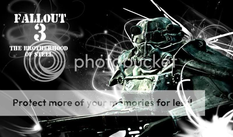
 Fallout 3: Brotherhood of Steel
 Halo: Master Chief

If you want this as a background, I can flip it for you accordingly.
Dirge of Cerberus

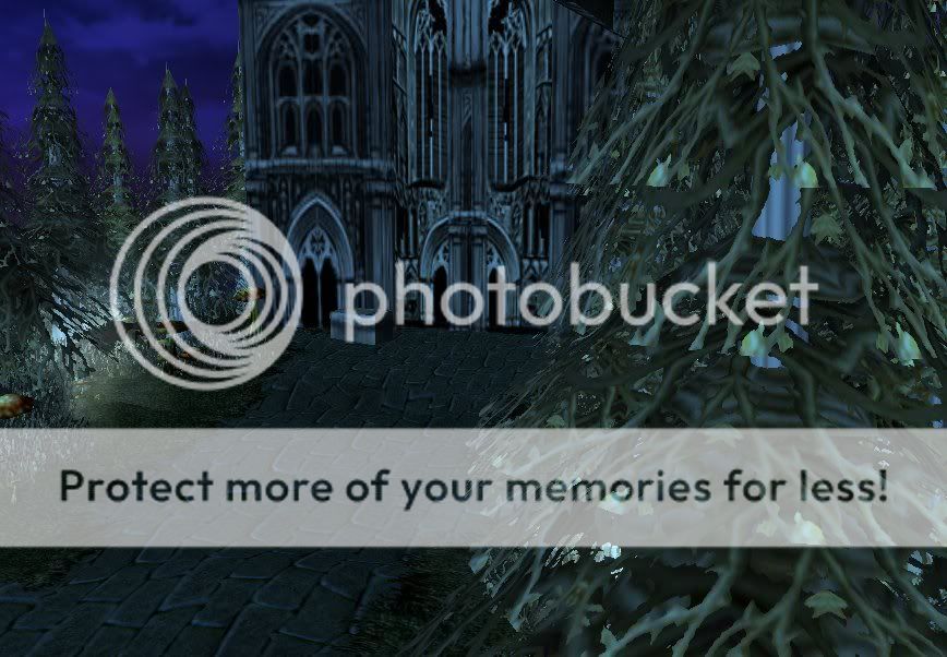
This is some Terrains I did before my computer crashed..
Dark Castle
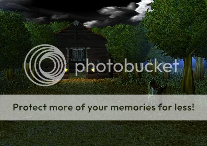
 Lone Cabin
These are ordered Oldest to Newest.
Gir 1
If you want this as a background, I can flip it for you accordingly.
This is some Terrains I did before my computer crashed..
Dark Castle

