
jonadrian619
-___-
- Reaction score
- 240
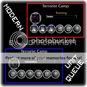
Here is the unit queue + progress bar I have made (100% freehand and photoshopped) for my warfare CTF map Demolition X. I have named it Modern Unit Queue because of it's more modern look in-game compared to the default Wc3 Unit Queue.
Info:
Well I wanted to make a new concept in unit queues, and instead of squares that contain the icons of the units trained or upgrades researched, I have made spherical figures to make a more different look and a modern-style unit queue. This unit queue is best used for Warfare maps, Space maps or maps that have a sort of 'spacey' or futuristic theme or in a modern warfare setting.
Import Paths:
Here are the files inside the .zip in this thread, besides them their corresponding import paths when used in your map.
Modern Unit Queue - UI\Widgets\Console\Human\human-unitqueue-border.blp
Modern Progress Bar Border - UI\Feedback\BuildProgressBar\human-buildprogressbar-border.blp
Modern Progress Bar Fill - UI\Feedback\BuildProgressBar\human-buildprogressbar-fill.blp
Tips and Tricks:
To make the 'Training' and 'Research' texts blend w/ this unit queue's colors, go to Advanced>Game Interface then find Text - General - 'Training' and Text - General - 'Researching' fields then add a gray hex color code (like c44444444 or anything grayish). There you go, your unit queue interface is complete!
Please give me credit when you use it in your map. Don't edit it without my permission.
")

