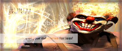
theclown

skullkidd

New Member
Reaction score
7
Rate out of x/5 please.
Which one is the best?

(i am just getting back into this, its been awhile)


[Edit] Took off to fix:thdown:


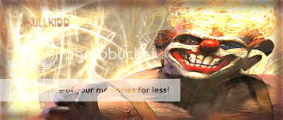
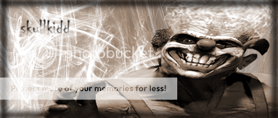
[Edit] put new ones on. Number one is the same, two and three are different.


#1 (same)
theclown.png

#2
theclown2.png

#3
theclown3.png
 

Sil3nt

SUP?
Reaction score
134
The render looks stretched.
The border is bad, doesn't suit it.
Same with the text.
The colors are dull and too monotone, a boring vibe.
It's probably brush+render+text+hue/sat so you shouldn't expect much out of it.
Overall, it's very bland with next to nothing effects that make it look eye catchy.

1/5. The 1 is for the effort.

/seriousfaceoff

Keep practicing and you will learn new techniques which will improve the quality of your works.
 

skullkidd

New Member
Reaction score
7
na its not stretched at all actually. and i never have used this shade before. but i think its good.
yah the border is bad. i rushed it
 

undeadorcjerk

The Ulitimate TheHelper.net Lurker
Reaction score
223
The render looks stretched.
The border is bad, doesn't suit it.
Same with the text.
The colors are dull and too monotone, a boring vibe.
It's probably brush+render+text+hue/sat so you shouldn't expect much out of it.
Overall, it's very bland with next to nothing effects that make it look eye catchy.

1/5. The 1 is for the effort.

Sorry dude... i'm going to have to go with this. It pretty much sums it all up.
 

esb

Because none of us are as cruel as all of us.
Reaction score
329
The reason he looks 'stretches' is because he is kind of slanted. The render is like an angle shot. Then the background is straight, thus makes it look weird. So it doesn't really blend well.

Try to add effects over the render, else it looks like a background with a render ontop.
Try to add at least some color to the render, maybe just the color of his face-makeup, the other black and white or something.

Not bad, but can improve.
 

esb

Because none of us are as cruel as all of us.
Reaction score
329
I choose the second one, as a single color doesn't do it for me :p

Try leaving the original color on his hair and makeup, and maybe slight color on the background effects and/or text.
His hair looks like a ball of fire.
 

esb

Because none of us are as cruel as all of us.
Reaction score
329
I meant some actual color...
 
D

Diablo185

Guest
i like the second one. The first one is too boring due to its lack of color, and the thirs seems a bit stretched out...keep it up 4/5
 
General chit-chat
Help Users
  • No one is chatting at the moment.

      The Helper Discord

      Members online

      No members online now.

      Affiliates

      Hive Workshop NUON Dome World Editor Tutorials

      Network Sponsors

      Apex Steel Pipe - Buys and sells Steel Pipe.
      Top