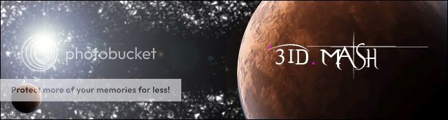
The pink dots are only there because thats my name in Call of Duty and it has the pink dots in it..so I felt I should keep them in the siggy. The BG is supposed to be kinda space-like? Lol.
I like the stylization of the text and the planet is good. I do not care for the background or the lighting source. Space should have a really distant and cold vacuum look and feel to it. That kind of looks fuzzy and close. If you can change that all the better and maybe eclipse your lighting on the left with the other more distant planet. Overall nice work. If you can fix that background even better.
I like the large planet.
The small planet stands out too much, because of the lens flare. The stars looks weird too, more like some rocky exterior or something.
The text is kind of cool, I would've preferred it in the bottom right corner, though, and slightly smaller.
If you're using photoshop you can use patterns to create stars.
First google 'stars' and find a picture with plenty of stars in it. Then download it and open it with photoshop, crop it so that you only have stars and space (like a big square), and then click 'edit' and 'define pattern' (at the bottom). Name it 'stars.jpg' (or whatever you like), and then you're done.
Now you can paint stars with the pattern tool.
i got that font! evanescence i think ..
anyways, i think the big planet on the right is decent and realistic enough but other than that is pretty simple what you did and doesnt look that great overall tho
Ghan has said he has fixed this. Monovertex please confirm this fix. This was only a problem with people that had signatures in the upper levels like not the special members but the respected members.