Under Attack [Something's missing.]

Syndrome

You can change this now in User CP.
Reaction score
126
n4xksy.jpg

Something I made recently, trying to create lightning bolts and stuff. This is what I created by accident :p

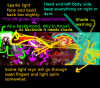
I think I got lighting down now... Maybe. Omni's and Directional Light I can sort of manipulate, but my ideas still need tweaking.

Something's definitely wrong with this picture. Or missing. Or both.
Someone help me identify it -_-.

EDIT: And I mean seriously take this apart. I want to learn :p
Things I noticed when I'm not looking at this from photoshop: The focal is all messed up, the lighting actually throws loads off... any more?
 

Whitesock

Graphics Help Zone Moderator
Reaction score
358
The lighting to the left of the face is much stronger than near the face. Try changing it to be the other way around.

Also, I think I know what the main problem is here. It's the fact that all the lines in this piece lead away from your focal, not towards it. For example...

attachment.php


The lines are showing the direction of movement. Want a quick fix? Move you person to the left side of the sig (so top left corner, but make sure it's not directly on the corner). Or, you could just flip the backround horizontally, though you may need to do some lighting adjustment.

Another thing. Your choice of color is good, but you only have one color. If you want this piece to pop, change that gray farther out backround to a greenish blue color. This will contrast that red and make it pop out even more, making it appeal to the eye better. If you want to make a color pop out just use the complimentary color or something very close to it (like greenish-blue, where red's complimentary color is actually green).

About the placement of the render. I feel the face is too high. Now I also like how you have that hand fully in the sig, but I feel the face needs to be moved down anyways. I would suggest increasing the sig's height by like 20-50 pixels and moving the render further down, our rotating the render counter clockwise a bit. This will give your focal some space to breathe and it would follow our favorite rule of thirds much better.

Now on to the lighting. I know that you are using lighting to emphasize the focal, which is great, but keep in mind that when solid chunky hair (like what this drawing has) casts a shadow. I don't see shadows where there needs to be shadows. Make sure you keep things realistic. Also, with shadows don't just use black. Unless it's a shadow on a pure white color, use a dark complimentary color of the color that the shadow is being cast upon. For example, on a skin tone, use a dark blue color. Also, keep in mind that shadows are not very saturated at all, so no vivid colors. Keep your choices closer to the low saturation side of the color picker.

That's all I got for now. I'm sure I could find some more things, but get started on those first :p. If you need me to demonstrate any of the color theory and such just tell me and I'll make some samples.
 

Attachments

  • sigfix.jpg
    sigfix.jpg
    64.8 KB · Views: 290

Syndrome

You can change this now in User CP.
Reaction score
126
The lighting to the left of the face is much stronger than near the face. Try changing it to be the other way around.

Also, I think I know what the main problem is here. It's the fact that all the lines in this piece lead away from your focal, not towards it. For example...

attachment.php


The lines are showing the direction of movement. Want a quick fix? Move you person to the left side of the sig (so top left corner, but make sure it's not directly on the corner). Or, you could just flip the backround horizontally, though you may need to do some lighting adjustment.

Another thing. Your choice of color is good, but you only have one color. If you want this piece to pop, change that gray farther out backround to a greenish blue color. This will contrast that red and make it pop out even more, making it appeal to the eye better. If you want to make a color pop out just use the complimentary color or something very close to it (like greenish-blue, where red's complimentary color is actually green).

About the placement of the render. I feel the face is too high. Now I also like how you have that hand fully in the sig, but I feel the face needs to be moved down anyways. I would suggest increasing the sig's height by like 20-50 pixels and moving the render further down, our rotating the render counter clockwise a bit. This will give your focal some space to breathe and it would follow our favorite rule of thirds much better.

Now on to the lighting. I know that you are using lighting to emphasize the focal, which is great, but keep in mind that when solid chunky hair (like what this drawing has) casts a shadow. I don't see shadows where there needs to be shadows. Make sure you keep things realistic. Also, with shadows don't just use black. Unless it's a shadow on a pure white color, use a dark complimentary color of the color that the shadow is being cast upon. For example, on a skin tone, use a dark blue color. Also, keep in mind that shadows are not very saturated at all, so no vivid colors. Keep your choices closer to the low saturation side of the color picker.

That's all I got for now. I'm sure I could find some more things, but get started on those first :p. If you need me to demonstrate any of the color theory and such just tell me and I'll make some samples.

Woah, thanks a lot! Must've taken you long to write that out :p [+Rep]
I'll get started on corrections when I get home from school, but I need to travel this weekend so I might not get it done.

I agree with you especially with the flow, thanks for clearing that up for me :D. the arrows really helped lol xD

Thanks again! I'll work on it very soon :3
EDIT: 'You must spread some Rep around before giving to Whitesock again.' -_-.
 

thewrongvine

The Evolved Panda Commandant
Reaction score
506
Spread some here. :)
Well I can't really say anything that Whitesock hasn't said, lol.
So this post is a goodjobluckpost.

~Hai-Bye-Vine~
 

Sooda

Diversity enchants
Reaction score
318
I starred that signature picture and mainly I did not understand what is happening on the picture, who attacks from where?
It is cool when many things are in focus which deserve attention. Flares are well done, sparks are good, girl itself is well done.
It is easier to critique than do, if you try to achieve realism (or similar) with focus and shading does flares (background) can be in focus exactly like face (middle)? Hand (front) is out of focus) which gives starting point. Now one of face (middle) or flares (background) should again get out of focus.

The neckles gets way too much attention (focus and light). I don't know does that neckles have super-powers and that is why it is important.

Sparks and that light rift gives you opportunity to play with light.

Picture which supposedly makes it more clear (yeah right XD sry for opportunity -> oppurtunity):
original:
n4xksy.jpg


suggestions:
attachment.php


I don't know how to create light and shades in graphics program, but I know how they should look.
This is not ONLY right way, there are many, it should be one of many approaches and don't others hesitate to suggest their way.
 

Attachments

  • Yada-yada.png
    Yada-yada.png
    148.1 KB · Views: 284

Syndrome

You can change this now in User CP.
Reaction score
126
I starred that signature picture and mainly I did not understand what is happening on the picture, who attacks from where?
It is cool when many things are in focus which deserve attention. Flares are well done, sparks are good, girl itself is well done.
It is easier to critique than do, if you try to achieve realism (or similar) with focus and shading does flares (background) can be in focus exactly like face (middle)? Hand (front) is out of focus) which gives starting point. Now one of face (middle) or flares (background) should again get out of focus.

The neckles gets way too much attention (focus and light). I don't know does that neckles have super-powers and that is why it is important.

Sparks and that light rift gives you opportunity to play with light.

Picture which supposedly makes it more clear (yeah right XD sry for opportunity -> oppurtunity):
original:
n4xksy.jpg


suggestions:
attachment.php


I don't know how to create light and shades in graphics program, but I know how they should look.
This is not ONLY right way, there are many, it should be one of many approaches and don't others hesitate to suggest their way.

Lol Sooda, thanks a lot :p The lighting feedback really helped a lot :D
I would rep you, but I already did -_-... I'll rep you later xD
EDIT: Best Editted Picture goes to Sooda. It looks like a Gundam went through my signature xD
 
General chit-chat
Help Users
  • No one is chatting at the moment.
  • Monovertex Monovertex:
    How are you all? :D
    +1
  • Ghan Ghan:
    Howdy
  • Ghan Ghan:
    Still lurking
    +3
  • The Helper The Helper:
    I am great and it is fantastic to see you my friend!
    +1
  • The Helper The Helper:
    If you are new to the site please check out the Recipe and Food Forum https://www.thehelper.net/forums/recipes-and-food.220/
  • Monovertex Monovertex:
    How come you're so into recipes lately? Never saw this much interest in this topic in the old days of TH.net
  • Monovertex Monovertex:
    Hmm, how do I change my signature?
  • tom_mai78101 tom_mai78101:
    Signatures can be edit in your account profile. As for the old stuffs, I'm thinking it's because Blizzard is now under Microsoft, and because of Microsoft Xbox going the way it is, it's dreadful.
  • The Helper The Helper:
    I am not big on the recipes I am just promoting them - I use the site as a practice place promoting stuff
    +2
  • Monovertex Monovertex:
    @tom_mai78101 I must be blind. If I go on my profile I don't see any area to edit the signature; If I go to account details (settings) I don't see any signature area either.
  • The Helper The Helper:
    You can get there if you click the bell icon (alerts) and choose preferences from the bottom, signature will be in the menu on the left there https://www.thehelper.net/account/preferences
  • The Helper The Helper:
    I think I need to split the Sci/Tech news forum into 2 one for Science and one for Tech but I am hating all the moving of posts I would have to do
  • The Helper The Helper:
    What is up Old Mountain Shadow?
  • The Helper The Helper:
    Happy Thursday!
    +1
  • Varine Varine:
    Crazy how much 3d printing has come in the last few years. Sad that it's not as easily modifiable though
  • Varine Varine:
    I bought an Ender 3 during the pandemic and tinkered with it all the time. Just bought a Sovol, not as easy. I'm trying to make it use a different nozzle because I have a fuck ton of Volcanos, and they use what is basically a modified volcano that is just a smidge longer, and almost every part on this thing needs to be redone to make it work
  • Varine Varine:
    Luckily I have a 3d printer for that, I guess. But it's ridiculous. The regular volcanos are 21mm, these Sovol versions are about 23.5mm
  • Varine Varine:
    So, 2.5mm longer. But the thing that measures the bed is about 1.5mm above the nozzle, so if I swap it with a volcano then I'm 1mm behind it. So cool, new bracket to swap that, but THEN the fan shroud to direct air at the part is ALSO going to be .5mm to low, and so I need to redo that, but by doing that it is a little bit off where it should be blowing and it's throwing it at the heating block instead of the part, and fuck man
  • Varine Varine:
    I didn't realize they designed this entire thing to NOT be modded. I would have just got a fucking Bambu if I knew that, the whole point was I could fuck with this. And no one else makes shit for Sovol so I have to go through them, and they have... interesting pricing models. So I have a new extruder altogether that I'm taking apart and going to just design a whole new one to use my nozzles. Dumb design.
  • Varine Varine:
    Can't just buy a new heatblock, you need to get a whole hotend - so block, heater cartridge, thermistor, heatbreak, and nozzle. And they put this fucking paste in there so I can't take the thermistor or cartridge out with any ease, that's 30 dollars. Or you can get the whole extrudor with the direct driver AND that heatblock for like 50, but you still can't get any of it to come apart
  • Varine Varine:
    Partsbuilt has individual parts I found but they're expensive. I think I can get bits swapped around and make this work with generic shit though

      The Helper Discord

      Members online

      No members online now.

      Affiliates

      Hive Workshop NUON Dome World Editor Tutorials

      Network Sponsors

      Apex Steel Pipe - Buys and sells Steel Pipe.
      Top