Side picture of Ghan_04.

tom_mai78101

The Helper Connoisseur / Ex-MineCraft Host
Staff member
Reaction score
1,733


--------------

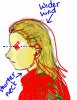
I did this mainly just to practice on the head and the facial features. I'm not going to shade the clothes, because it's not my main practicing object.

I wondered if the nose is crooked, or the hair isn't natural, or the eyes aren't good enough.

Criticisms are accepted. :D Hopefully, not about the clothes. ;)

EDIT: The black thick lines are there for a reason. I drew this picture on a scale of 1 to 3000 percent. (That means, I magnified the picture up to 3000%, then I drew the picture.)
 

MisterFrank

New Member
Reaction score
4
Unless there's black highlights in his hair I see no reason for the black outlines, Try using shades of yellow, if his hair is really that yellow.
His ears are pointed. (intentional?)
And his eyebrows are black? You should post the picture you were drawing this from.
The face needs A LOT more detail. Add more shades.
And the sweater is 3 different shades of green? It should be 1 color with darker/lighter shades.
I can't say a lot because I would have to see the actual picture in comparison.
And you should have the picture take up most of the space as well.. there'ss to much white.
And his pupils are popping out of his eyes as well. Instead of having those sketch lines for outlining use one bold line.
My advise is to practice some more and look at others work. Maybe look at some tutorials on youtube.

Hopefully this helps.
 

Pineapple

Just Smile.
Reaction score
576
Ghan_04 is an Admin here.

His display picture is Legolas. So yes, Tom's drawing Legolas.
 

vypur85

Hibernate
Reaction score
803
Ear and eye are a little bit off. Not much of problem in these though. Still look fine even though they're 'not right'. Most comic artists have different way of drawing something 'wrong' but still look fine.

The only problem is... the long neck.

Some other things that may need more work. Use finer smoother lines and try to reduce sketch mess (lines jutting out stuff).
 

thewrongvine

The Evolved Panda Commandant
Reaction score
506
Bad posture. That is all I shall contribute.

A person can have their own posture, :p

:O The shading on the face like under and above his eye, the curve there seems strange to me, but I may be wrong.

You have like 2 primary shading colors, his normal skin tone, and then a darker shadowed one, but then you have another dark yellow that doesn't match well in my opinion, like it contrasts too much, a sudden change in shadow. So maybe either stick with 2, a normal and a dark (and possibly a lighter) shading, for a somewhat cartoonish look, or then use more shades, but then they would need to go slowly and naturally, unless on purpose. o.o

GJ, :thup:

~Hai-Bye-Vine~
 

tom_mai78101

The Helper Connoisseur / Ex-MineCraft Host
Staff member
Reaction score
1,733
Hm...I thought all members recognize Ghan_04...and yes, it's Legolas, I just forgot the name. That's the entire picture right there.

I've been trying to control my hand from trembling, so I had to use a smaller resolution to draw this piece.

And I couldn't try finding how to shade a head correctly. Searching Google tends not to aid me for a good reference.

@Whitesock:

How far back is the eye?

@Thewrongvine:

It's just for practicing the basic shading method, not blurring the lines.
 

Sooda

Diversity enchants
Reaction score
318
I even didn't notice eye position, move eye with eyebrow almost where it connects with nose top line. See how it looks, if too close make a small cap between nose line and eyebrow. Eye height is fine.
Again I like it all, black in hair, I think you got talent tom_mai78101. Trust more your inner thought.
If you cache realism, post always reference picture. Currently people are suggesting things to change which fit perfectly to cartoon alike interpretation of Legolas just to get realistic 1:1 photo feel.
If you indented 3 colour shirt, it is fine, why to change it millions of colours? No need, another picture another time.
 

Whitesock

Graphics Help Zone Moderator
Reaction score
358
@tom

Kyrle%20Bellew%20portrait%20in%20profile-Photo-B&W-Resized.jpg


Notice how the eyes are much closer to the nose. The ones you have almost touch what would be the ears. :p
 

tom_mai78101

The Helper Connoisseur / Ex-MineCraft Host
Staff member
Reaction score
1,733
Not realistic.

I see. But, you wouldn't be expecting realism from a guy who started drawing just after reading a lot of Pokemon mangas. Anyway, I'll do my best to make it more realistic.

Notice how the eyes are much closer to the nose. The ones you have almost touch what would be the ears. :p

Ok...I'll try drawing near the nose. But to be honest, I don't know why the eyes must be drawn close to the nose. The picture you gave me shows a head that's turned 90 degrees away from us. I didn't draw the head to be exactly 90 degrees...:confused:
 

vypur85

Hibernate
Reaction score
803
Hope you don't mind. Kinda free now. Made some correction for your reference:

attachment.php


Eyes slightly closer. Ear should be higher to level the eye. Head should be slightly wider. Neck length is reduced.

It looks... 90 degrees view to me.
 

Attachments

  • Person.jpg
    Person.jpg
    41.9 KB · Views: 310

Whitesock

Graphics Help Zone Moderator
Reaction score
358
Ok...I'll try drawing near the nose. But to be honest, I don't know why the eyes must be drawn close to the nose. The picture you gave me shows a head that's turned 90 degrees away from us. I didn't draw the head to be exactly 90 degrees...

Because of the angle of the nose and mouth, and the shape of the head, it looks like the head is in profile to me.
 

tom_mai78101

The Helper Connoisseur / Ex-MineCraft Host
Staff member
Reaction score
1,733
Oh, I can see it now...that's a good diagram!!

Thanks everyone! :D
 

tooltiperror

Super Moderator
Reaction score
231
There`s a sort of realism that comes with Anime and Manga, and you lack it.

You need better shading.
 

tom_mai78101

The Helper Connoisseur / Ex-MineCraft Host
Staff member
Reaction score
1,733
There`s a sort of realism that comes with Anime and Manga, and you lack it.

You need better shading.
I know...the differences are very obvious.

But, I prefer manga drawings more than realistic drawings. I love mixing them up.

And no, I must not practice shading until I have mastered the head parts (eyes, hair, mouth, facial expressions, etc.). Shading, to me, is a bit more advanced than drawing the shape of the eyes. Hence I have noted this in my first post.

I do vowed myself to devote my free time drawing and mastering the shading techniques. So, don't you worry a thing from me! ;)
 
General chit-chat
Help Users
  • No one is chatting at the moment.

      The Helper Discord

      Members online

      No members online now.

      Affiliates

      Hive Workshop NUON Dome World Editor Tutorials

      Network Sponsors

      Apex Steel Pipe - Buys and sells Steel Pipe.
      Top