Some more sigs...Opinions?

hobo218

Meh
Reaction score
75
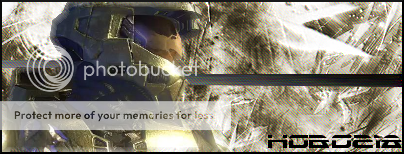
Here's a Halo sig I made.
I can't decide which version I like better. If anyone really wants this one I can still find the layered version.

halolayered5.png


halolayered6.png


Opinions and/or Feedback?

[EDIT]
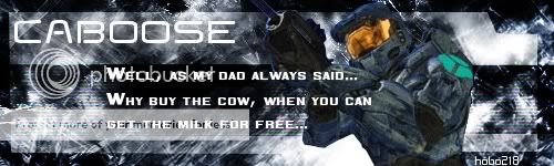
Here's a RvB sig I made a while back, thought I'd share it. Not looking for any feedback because I just made it for fun.

Caboose.jpg


[EDIT]
-Most Current Version-
halotest2.png
 

Halo_king116

Working As Intended
Reaction score
153
The border looks good. I like just about everything about it, but there is one thing I don't know thatdoesn't make it perfect.

For the one with the lines or w.e they are, perhaps not put them over the render area, or something like that. Just a suggestion.

Just wait until Orc_Tamer and w/e come here and bash it :p


8/10
 

w/e

Boaroceraptorasaurus-Rex
Reaction score
275
The text is misplaced on all three. I like the halo backgorund. The one with the pattern is better but, the pattern should be behind the render. I don't like the horizontal lines that run across it. The render also seems like it came in a better quality. The caboose one has to much text. I think. And you should make hobo218 the central object. Otherwise they're good.
Halo: 7/10.
Caboose: 6.5/10
Bashing complete. :)
 

sqrage

Mega Super Ultra Cool Member
Reaction score
514
w/e said:
The text is misplaced on all three. I like the halo backgorund. The one with the pattern is better but, the pattern should be behind the render. I don't like the horizontal lines that run across it. The render also seems like it came in a better quality. The caboose one has to much text. I think. And you should make hobo218 the central object. Otherwise they're good.
Halo: 7/10.
Caboose: 6.5/10
Bashing complete. :)
just because it's not cliche doesn't mean the text is misplaced
 

w/e

Boaroceraptorasaurus-Rex
Reaction score
275
Sorry, what I meant was I think it would look better if it was elsewhere. :eek:
 

Rinpun

Ex TH Member
Reaction score
105
I like the text on the Caboose sig (it's a good quote :p). However, you could try flushing it to the left below "Caboose".
 

hobo218

Meh
Reaction score
75
halotest.png


How's that?

And w/e, I wasn't askin for any feedback on the Caboose one, and it's a quote from RvB... :p
Wasn't intended for a sig...

Though I do see what you're saying Rinpun. Unfortunatly I don't think I have the xcf for that anymore....lol
 

w/e

Boaroceraptorasaurus-Rex
Reaction score
275
Sorry. This one loogs much much better. The render and BG are in perfect sync in terms of color and now the font is on top. But I think the font needs to be clearer and the sig shorter. Than it'll be great. ;)
 

Halo_king116

Working As Intended
Reaction score
153
The text... Does it say Kobo28?

Lmao :p Other than that I think it looks good. But who am I to tell?
 

hobo218

Meh
Reaction score
75
Nah, hobo218, :p but I couldn't find any other font's that looked really good. The ones that I like I use/other people use to much..

Thanks for the feedback guys.
 

w/e

Boaroceraptorasaurus-Rex
Reaction score
275
I have a crapload of fonts. Want me to upload?
 
General chit-chat
Help Users
  • No one is chatting at the moment.

      The Helper Discord

      Members online

      No members online now.

      Affiliates

      Hive Workshop NUON Dome World Editor Tutorials

      Network Sponsors

      Apex Steel Pipe - Buys and sells Steel Pipe.
      Top