Throwie

n[u]ll

You can change this now in User CP.
Reaction score
93
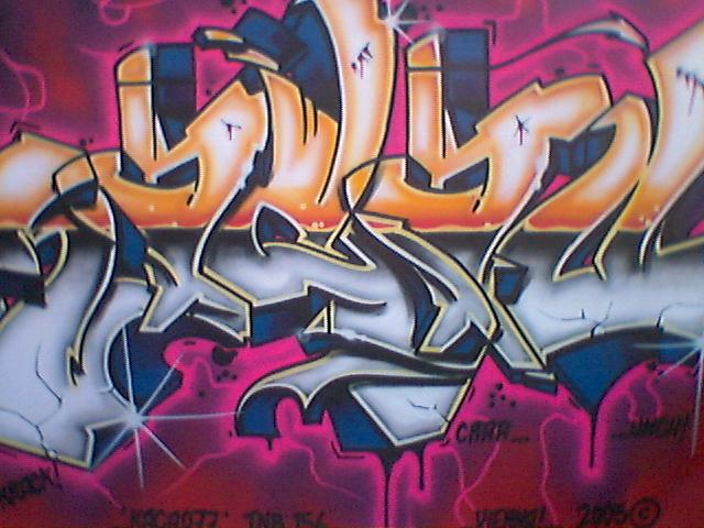
Trying to get into graffiti.. Sketched this up in class today and when I got home i traced it on Illustrator CS4. Added a drop shadow to give it some depth (which is the next thing I'm going to work on when sketching).

Epic Win? Fail? Roflcopter? You decide:
 
Last edited by a moderator:

ReVolver

Mega Super Ultra Cool Member
Reaction score
608
you phail because I can read it, usually when people show me graffiti its like in a whole new language :p j/k it looks good, some color would of helped.

Example
graffiti1.jpg
 

esb

Because none of us are as cruel as all of us.
Reaction score
329
A throw-up (like the one he tried doing) IS supposed to be read, most of the time, and is not too artistic. As like it's name suggest, it's thrown, quickly. So you put it on stickers or something, and paste it on a stop sign or w/e.
What ReVolver put is graffiti, which is different.
Throwie is more like tagging :p

But yeah, it's good for a first. A drop shadow isn't too hard while sketching though, but you should get the hang of it quickly and soon. Pretend there's a light source somewhere around the text, and try to imagine where/how the shadow would be.
 

n[u]ll

You can change this now in User CP.
Reaction score
93
thx esb :D

idk how many times ive had people help me with drop shadows.. i just suck at them, but im getting better XD.


esb, you sound like you know a lot of this stuff. you do any tagging or anything?
 

esb

Because none of us are as cruel as all of us.
Reaction score
329
I do tagging and graffiti on notebooks and paper, not on walls nor with spray cans (probably not yet, if I do it will be on wooden boards that I get). I don't like vandalizing other people's stuff.

And here in Los Angeles, it's very popular and well known by a lot. Most of my friends are taggers and into graffiti. It's really great art, everyone has their own style (usually) and every piece is unique.
 

Sintoras

Shaaakaa!
Reaction score
45
In a couple months I'll be able to give you advice, because at my school theres a grafitti class :D

I might increase the proportions of the letters, idk, make the bottom fat and the top thin so it looks a little more stylish. I hope ypu know what I mean :D

Sintoras
 

monoVertex

I'm back!
Reaction score
460
Too plain and it seems that there is no specific style in it. But it's good for a fast sketch ;).

Btw, graffiti is teh sex! xD One of the best forms of art ever known to mankind.
 

esb

Because none of us are as cruel as all of us.
Reaction score
329
True on the style. Usually they're kept the same throughout all the letters. Like the H is thick all around (all 3 'sticks'), but the other letters seem to be skinnier and even more skinny on the bottom or top. I personally like the H a whole lot better =D

And Graffiti is teh secks!
 
General chit-chat
Help Users
  • No one is chatting at the moment.

      The Helper Discord

      Members online

      No members online now.

      Affiliates

      Hive Workshop NUON Dome World Editor Tutorials

      Network Sponsors

      Apex Steel Pipe - Buys and sells Steel Pipe.
      Top