jonadrian619
-___-
- Reaction score
- 240
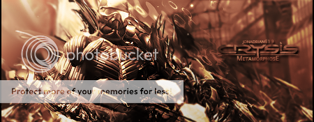
I got really C4D-oriented lately. I did this in my own way and I kind of like the outcome. Besides it's for SOTW #126 anyway... ^___^
CnC as always... thanks!

") https://www.thehelper.net/threads/crispy-fried-pork-chops.193874/
https://www.thehelper.net/threads/crispy-fried-pork-chops.193874/

