Argentinian Sig!?

Ozzdog

Hopeless Toby Driver fan boy
Reaction score
65
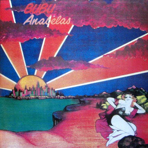
Well I didn't really create this at all, but rather altered the album art of an album called Anabelas by Bubu (1978). I use it as my signature on ProgArchives.com and I am aware that it is quite large, but people on that site don't care how big it is, they like to see nice art!

Anyways, I realize I changed nothing drastic, just wanted to know if people think that I did a good job essentially enlarging the photo and adding my name into it.

Here is the ORIGINAL photo I used to create it:
cover_4331015102008.jpg

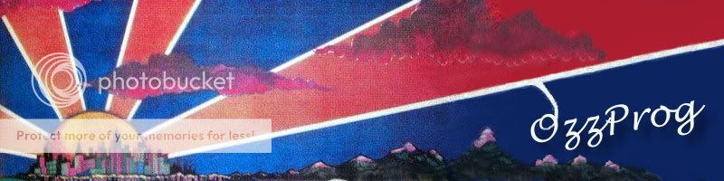
And here is the signature I created from it:
bubu.jpg
 

Ozzdog

Hopeless Toby Driver fan boy
Reaction score
65
How might I go about doing that, I am a photoshop noob? (I do everything through massive amounts of trial and error, ctrl+z = my best friend!)
 

Whitesock

Graphics Help Zone Moderator
Reaction score
358
Take the clone tool, pick up a heavy textured area on your sig (most likely holding down control and clicking to select an area). Make a new layer and click a few times over your text so you can't see it anymore. Providing your text is on a seperate layer, right click it and click alpha to selection. Invert the selection, select your texture layer, and click delete (this should delete out the textured area outside of your text). Desaturate the text layer. Put that layer on grain merge or overlay and play around with the opacity.
 

sqrage

Mega Super Ultra Cool Member
Reaction score
514
Wow, very nice job. It's barely noticeable where the stock image ends and your addition starts. If you add that grain it'll be even better.
 

thewrongvine

The Evolved Panda Commandant
Reaction score
506
Why does it say OzzProg? lol

Anyways, nice. Only a slight bit of difference, but it is good. :thup:

~Hai-Bye-Vine~
 

NightShade

Ultra Cool Member
Reaction score
31
Wow, very nice job. It's barely noticeable where the stock image ends and your addition starts. If you add that grain it'll be even better.
I didn't even notice that the stock image ended, I thought he just added a name. Because of this, it's a very good continuation.:thup:
 

Romek

Super Moderator
Reaction score
963
What did you actually do?
It looks like a crop at first glance, though I see you cloned the mountains or something?
 

elmstfreddie

The Finglonger
Reaction score
203
He did everything to the right of the grainy picture. (last 4 mountains and above them)

What you could do is just trace over the image and recolour it... Kind of like I did with a picture of Stalin in Design class (don't ask)
That takes a bit of time though.
You could also just add a filter to your side of it to make it look grainy. But it may be hard to match it to the image's grain.
 

Ozzdog

Hopeless Toby Driver fan boy
Reaction score
65
Well thanks for all the C&C, I'll definately work on getting different versions made (just text grainy, and maybe the whole thing grainy?) and post them up here eventually.

P.S.

thewrongvine said:
Why does it say OzzProg? lol
I am known here as Ozzdog, at the PROGressive rock website, i am known as OzzPROG, aren't I a clever fellow?
 
General chit-chat
Help Users
  • No one is chatting at the moment.

      The Helper Discord

      Members online

      No members online now.

      Affiliates

      Hive Workshop NUON Dome World Editor Tutorials

      Network Sponsors

      Apex Steel Pipe - Buys and sells Steel Pipe.
      Top