Nah, just kidding.
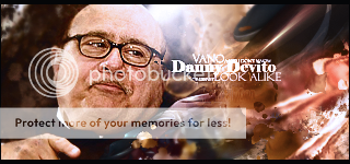
They are all great sigs, but the best one is the Danny Devito.
They all blend great and the depth is pretty good.
·L:
Pixelly hair = bad, maybe feather it a bit?
Anyway, it blends great, and the colors are nice. I don't really like how it goes from cartoon to 3D/photo.
6/10.
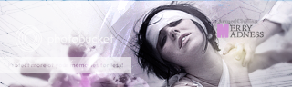
·Merry Madness:
Blends nicely, a nice depth, needs a border thou. Try a 1 pixel white border. And why is there a blueish stripe on the top?
7/10.
I'm on a page about incorrect corrections, and spent the better part of like two hours trying to get someone to understand that -5^2 = -25, not 25, and then that post had comments get reposted because that group is self sustaining, and that person was in turn trying to explain what I just explained to them. And I'm taking that as a victory
I will be AFK for a couple of days you guys hold down the fort while I am gone. I will be checking in on my phone but that will severly limit me. Be back saturday!


") https://www.thehelper.net/threads/crispy-fried-pork-chops.193874/
https://www.thehelper.net/threads/crispy-fried-pork-chops.193874/
