Sword not so Swordy

Exfyre

hmm...
Reaction score
60
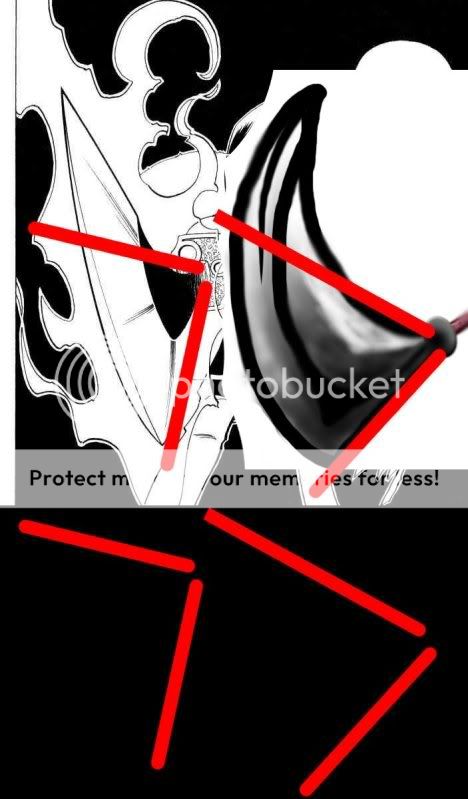
Made this from scratch using Photoshop. To me it looks like a sword, but to everyone I show it to they say, "oh, that's a nice horn."

What can I do to make it look more swordy and less... horny?

What I made:
2ymw3sj.jpg


Adding random stuff:
2qd5rpd.jpg
2d0jksk.jpg

I was originally going to make this into a warcraft icon, but it looked ugly @ 64x64, so I didn't.
 

Azlier

Old World Ghost
Reaction score
461
Reminds me of a feather duster, honestly.
 

Genkora

Frog blast the vent core!
Reaction score
92
Well, for one thing the value is too gradual. For shiny metal (like that of a sword), you want value to go from dark to light very quickly, you need extremely contrasting value to get that shine. Really bright brights, really dark darks.
 

monoVertex

I'm back!
Reaction score
460
No, he tried to draw a sword like it was pointed at your nose. It looks like a sword to me, but only because I've seen a very similar thing before :p. It is too blurry and the outline is too thick.
 

Whitesock

Graphics Help Zone Moderator
Reaction score
358
Way way too thick of an outline first off. Also I think the sharp bend on the bottom left is a bit too pointy. I would recommend using a reference. If you did use a ref, then I would recomment posting it here also so we can help you see where in the process you deviated too much from the ref.
 

Exfyre

hmm...
Reaction score
60
This was the image I focused on, but i last saw it about a year ago. It took me a while to find this today.
02.jpg


looking at it now, I can see a lot of what's wrong.

@Genkora, I will try to make a quicker transition from white->black, seems that you're right.
@13ade619, what do you mean by reducing the angle
@BANANAMAN, Nuh uh.
@Smith_S9, yeah. I was trying to draw it pointing outward and the lines are too thick
@Whitesock, Image above. I wasn't exactly looking at it as I did the ps work, but that is where I got most of what I did.
 

monoVertex

I'm back!
Reaction score
460
That's the exact image that came into my mind and made me think it was a sword :D. I recently read the Shaman King manga :p.
 

Jimpy

The Invisible Observer
Reaction score
277
I agree with much of the above said, black outlines are like 10X too thick, perspective is a bit odd, its very blurry, the gradients/colour changes should be somewhat quick, then with little imperfections in it (IE scratch marks and whatnot).

I think this would benefit alot from having the lines not drawn free-hand, the bottom right side of the sword (from the viewers perspective) should be straight but instead it has 2 sort of angle changes. Use a ruler/line tool for that bit. Maybe use guides for the curvey edges.
 

Exfyre

hmm...
Reaction score
60
Alright. Thanks to all who helped. I'll retry the pic when I have enough free time. I learned much :D.
 
General chit-chat
Help Users
  • No one is chatting at the moment.

      The Helper Discord

      Members online

      No members online now.

      Affiliates

      Hive Workshop NUON Dome World Editor Tutorials

      Network Sponsors

      Apex Steel Pipe - Buys and sells Steel Pipe.
      Top