WIPs Batch 3. Remember, authors, do not reveal yourself!
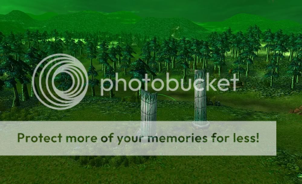
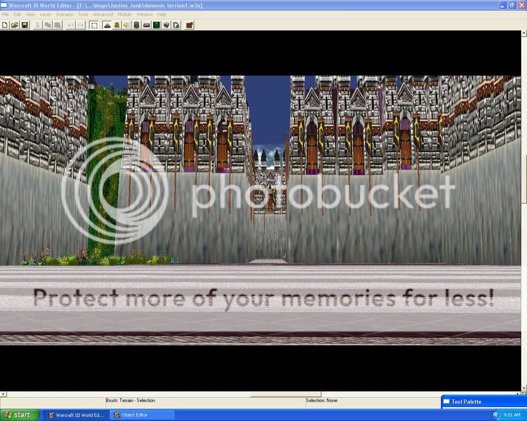
Terrain 1: (I know that he edited the screenshots, but for WIPs I allow this. I won't use these as finals though, the author will have to submit unedited pics)
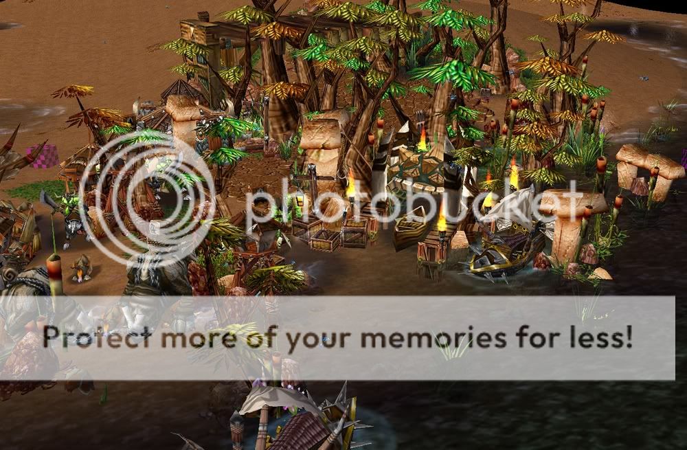
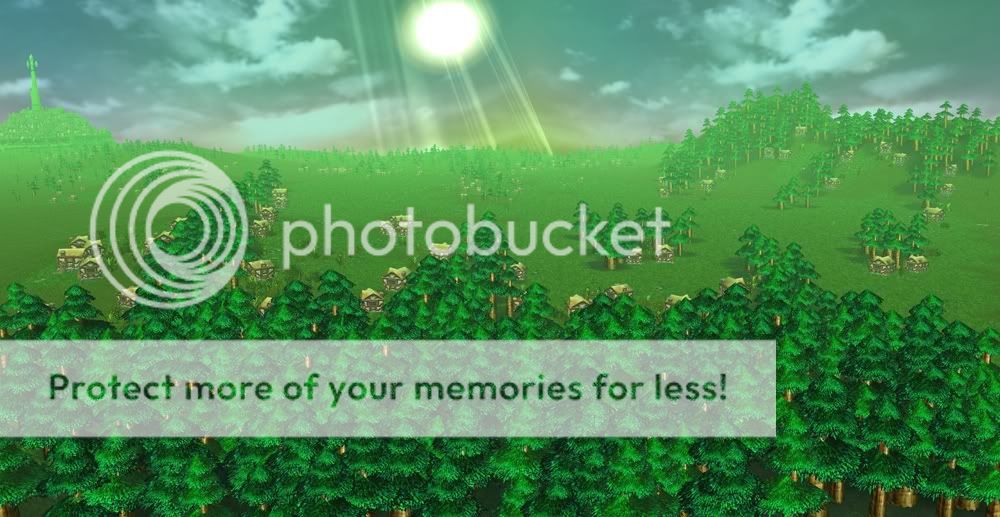
Terrain 2:
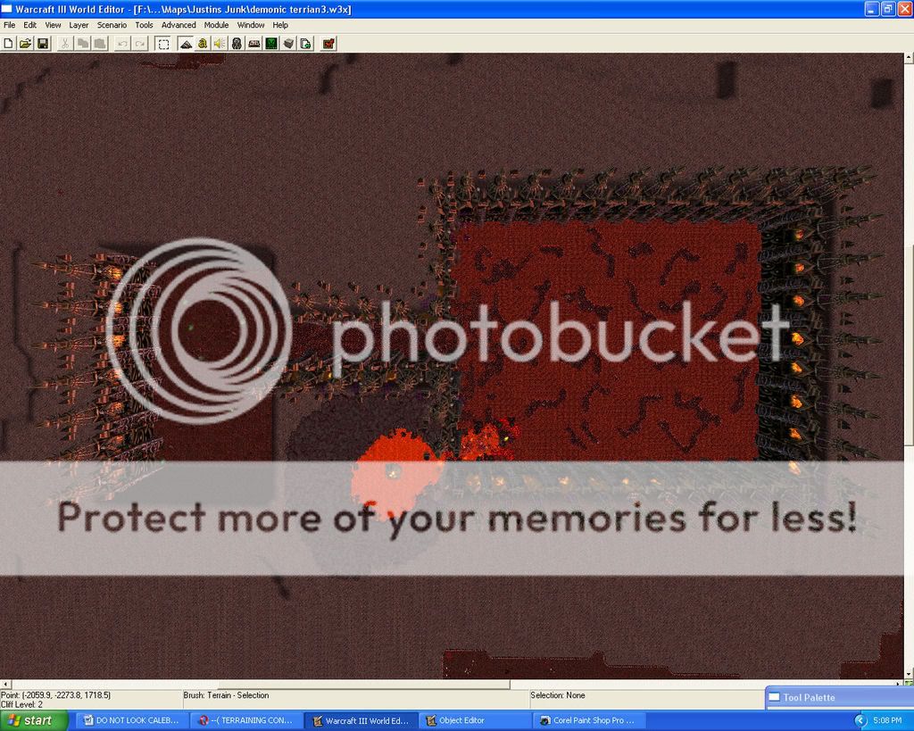
Terrain 3:
Terrain 4:
Terrain 5:
Terrain 6: (I know the second pic looks weird in that left side, but that is how the author sent it)
B: Cool, mystic theme. The Illidan is some kind of misplaced though I'ld say, and also the far-z is bad chosen resulting in some leaves seeming to float in the air without an connection to the trees. Also, in the foreground, some trees are enlightened and the ones just right to them are not - which doesn't perfectly fit.
A: Really chaotic and seemingly random. The undead buildings appeared out of nowhere, same with the gravestones. The water is too light and does not fit into the theme. The sky in the background has a too strong contrast to the "trees", and I think the buildings are overscaled too.
The same enlightenment problem as in B.
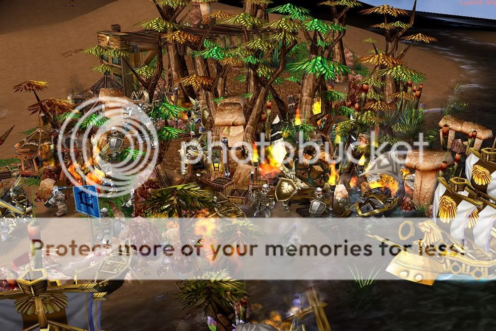
+Heavy rain & Fire at the same time... And too many lightnings!
Terrain 2:
B: Phew, when I look at it I don't know where to start. It just seems like a big, colorful blob ; ). The missing background also supports this effect.
When I look closer to it, I see lots of well planned details, like the drinking codos and the treetop-house.
Perhaps you should try to disperse the amount of details, and also cut of
some of the trees. This is a village/outpost afterall, not the jungle ; )
Also, the doodads should not intersect with the units
A: Actually, the same as above.
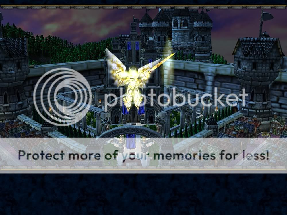
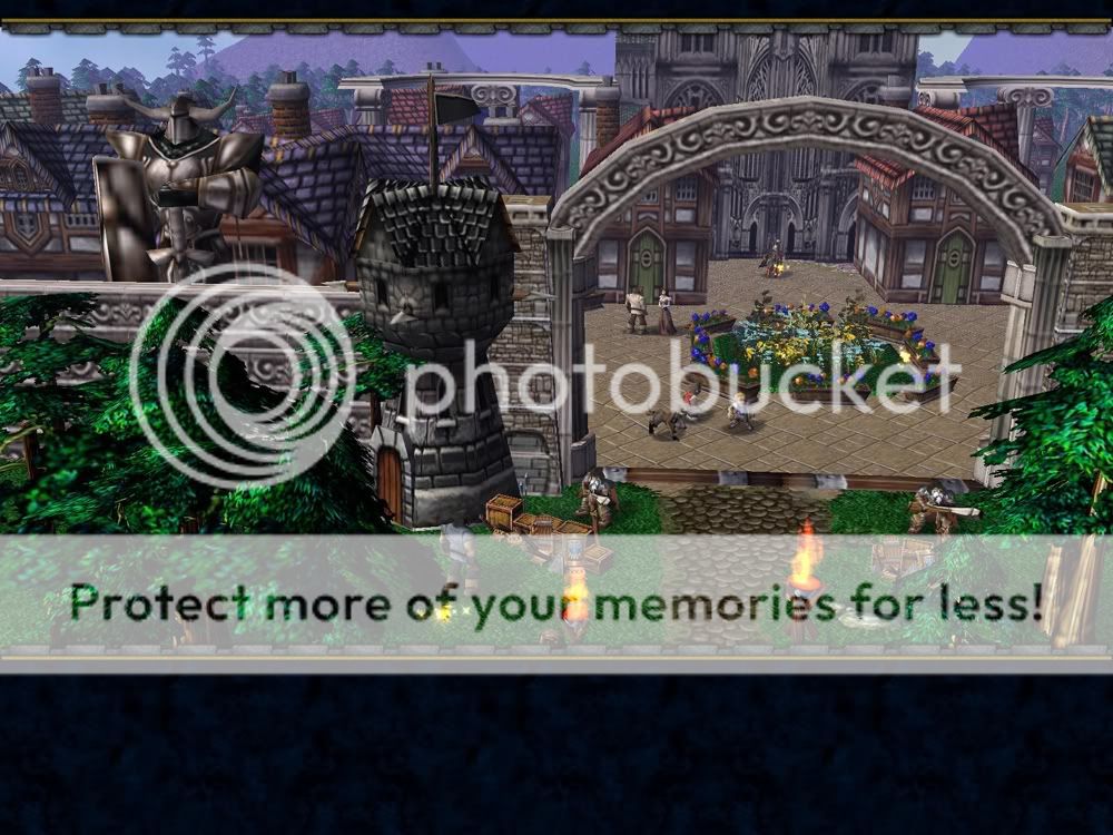
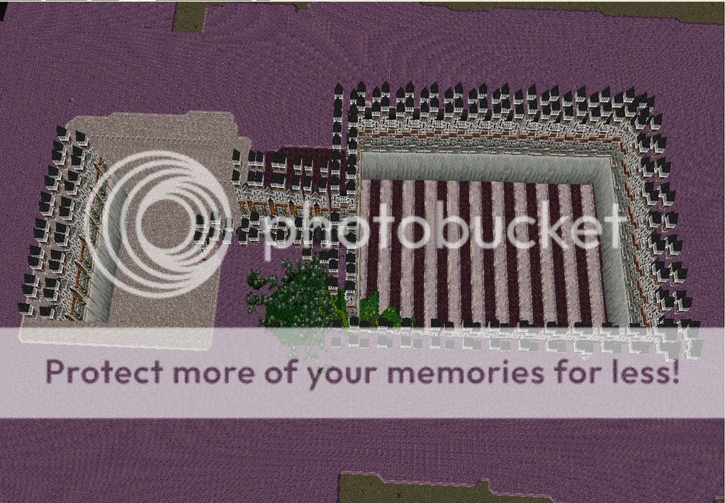
Terrain 3:
B: The trees are growing at impossible positions ( the castle's wall ), and some of them have just their leaves showing, but not the trunk - resulting in floating leaves.
The towers are either overscaled, or the houses are underscaled.
The houses shouldn't be that symetrical and perfectly positioned. Also the lightsources between them give them a strange look, you should rather set these light sources on the path than between the houses.
I actually love the parc, especially with the angel in the midst.
One of the flags is malpositioned though, it is the one in the foreground under the arc. You might try taking it out.
A: This one is really good. It has a clear center, and the rest is not that visible anymore. It still lacks detail, though. Also, for a better look, try using undead for the Interface instead of orc ; )
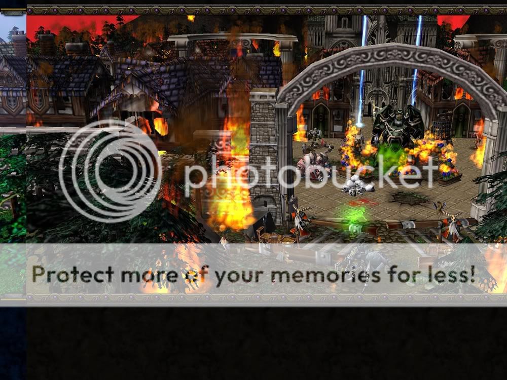
Terrain 4:
B: Apart from the strange cloud at the top-right corner, I really like this one. Seems to be part of the sky though, so you probably can't change it. The sky fits perfectly to the fog, and the depth your picture promotes is really cool.
Also you inserted many details, which is something others should do aswell.
There is one detail that doesn't see right, anyway: The red/black flame in the right background... Try removing it, and see if it looks better.
A: Well... This picture seems to be the first one, just with another fog, another sky and some recolored / replaced doodads. Also, I saw that all the details from B where removed... And now it seems to lack content.
Which is perhaps ok though, as it just shows how corrupted the wood became.
Also, I think you already noticed, there is a green circle on the water... Ya... >_> Remove it.
Also you could really try to do what "neckface" told, and have a civilisation cutting down the woods.
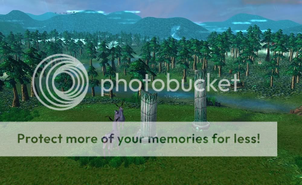
Terrain 5:
B+A:
Try a higher variety. The huts all look the same.
So do the trees and the fire.
The Wood is too dense, you should do a gradiental decrement of density instead of an immediat wood border. Forests grow slowly, not instantly.
Also, the sudden cut at the background looks ugly. I still like T4's approach here best, with the Mountains in the background as a barrier.
The city is far too much offhand, making it hard to actually see it.
B: Bushes are far too big. The terrain fog should rather be turquoise here than green, although it fits well with the trees. There is also no life, and little "lifeability". No wonder they are all sitting in their houses, without anything to do - perhaps add some fields, a windmill, a farm and whatever.
The rest, see the general comment.
A: At first glance, this just looks like a wonderful christmas image: Warm fires, beatiful snowflakes, Snowy plains and trees... Just like a childrens book.
At second glance, you see marrauding Axemen that are ... Standing arround in random directions. Also, there is trees that are much bigger than in B, just that they don't have leaves and that the others didn't grow at all. Also, there is too much fire. How on earth would marrauding axemen be able to set 400 Houses that are quite some way apart to flames at the same time oO.
They just stop burning one day.
Terrain 6
You really Improved terrain since last time, congrats : )
Perhaps you should work a bit at the background, though.
I don't care how you take your pictures and it's up to you in the specification. If you feel that is needed to specify which one is the ruined one, go ahead and specify.
I do know this - xenforo dropped the ball by not keeping the vbulletin reputation comments as a feature. The loss of the Reputation comments data when we switched to Xenforo really was the death knell for the site when it came to all the users that left. I know I missed it so much and I got way less interested in the site when that feature was gone and I run the site.
I'm on a page about incorrect corrections, and spent the better part of like two hours trying to get someone to understand that -5^2 = -25, not 25, and then that post had comments get reposted because that group is self sustaining, and that person was in turn trying to explain what I just explained to them. And I'm taking that as a victory